Duration
3 months
[02]The pressure
Fragmented reports, inconsistent KPI definitions, and spreadsheet reconciliation made performance conversations slow and defensive.
Teams disagreed on how supplier health was calculated before they could discuss what to do next.
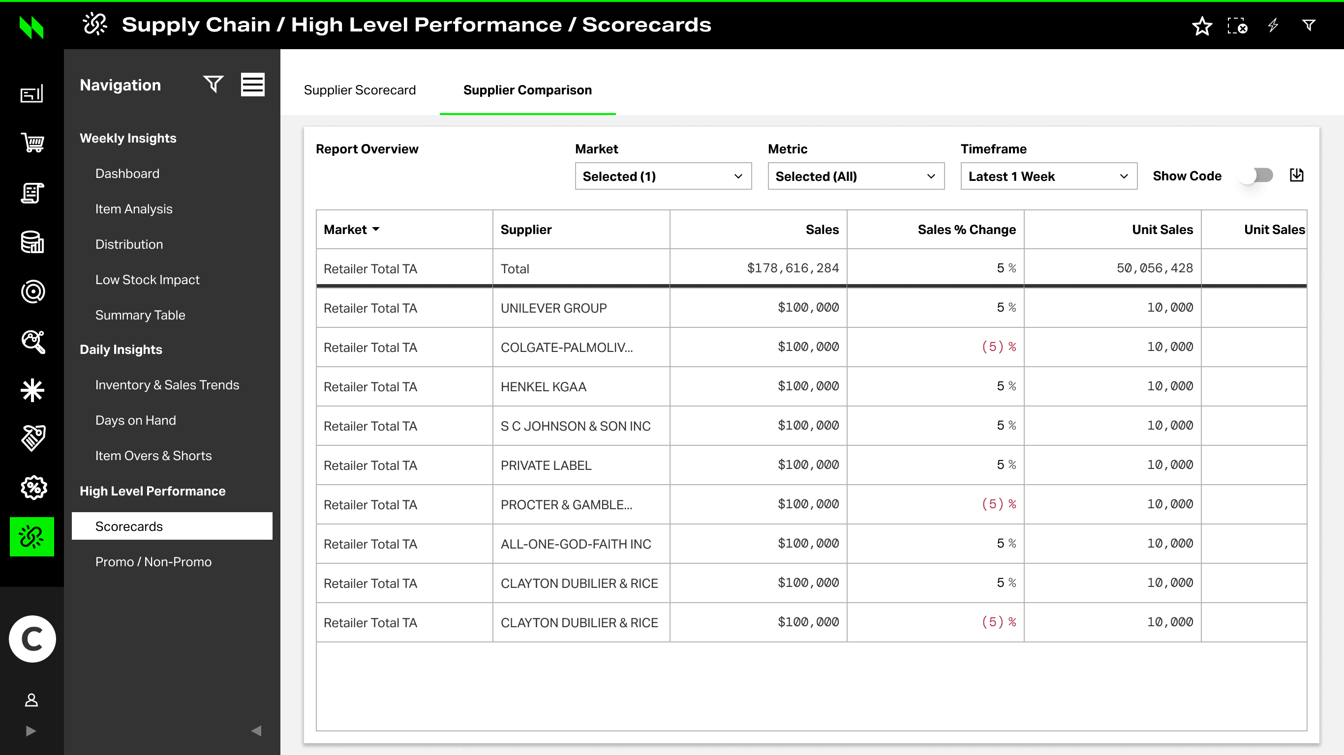
Period-over-period and peer comparison lived outside the main scorecard workflow.
Summary views did not connect cleanly to validation evidence both sides could inspect.
[03]Research & Insights
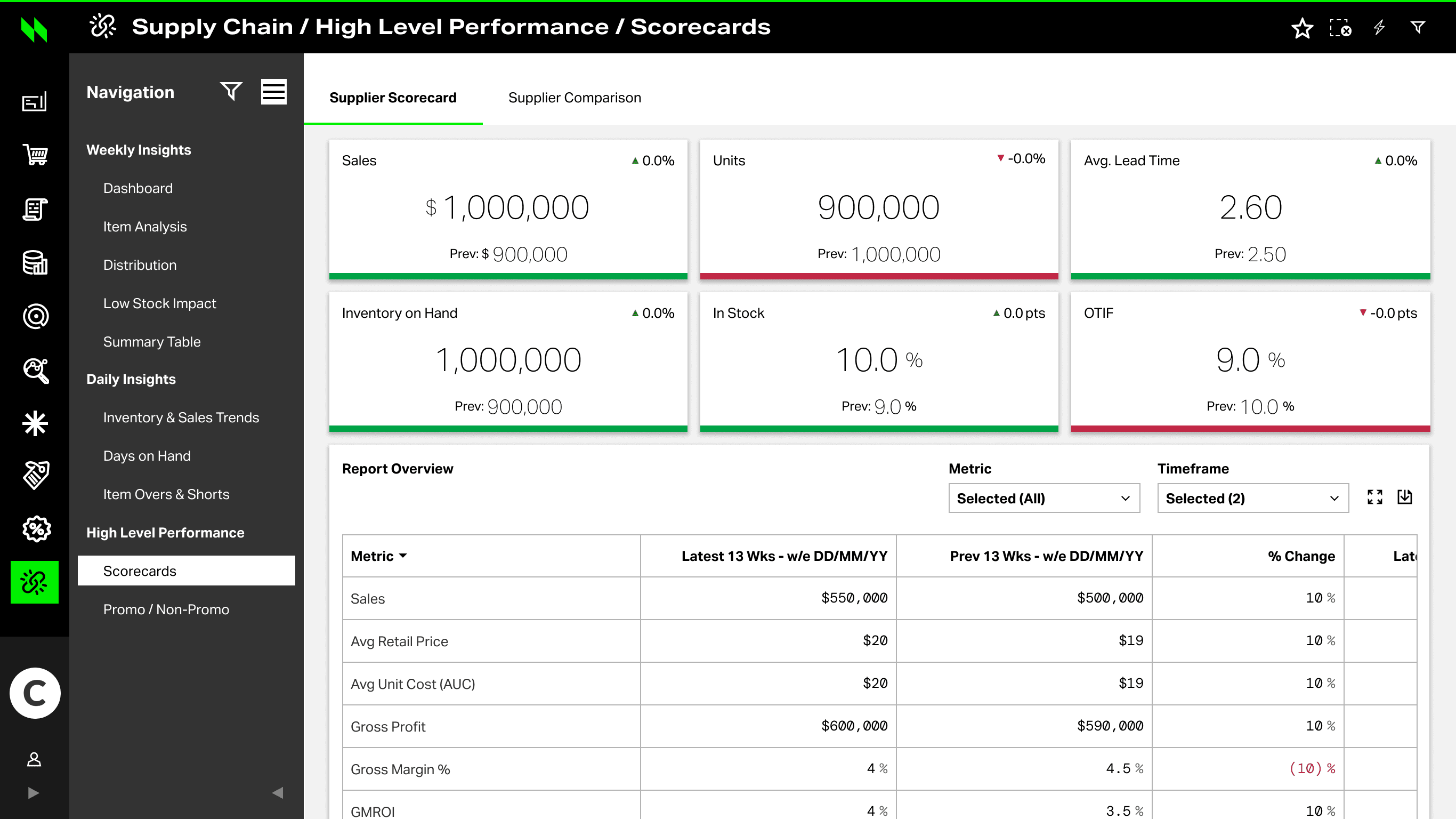
I reviewed legacy reporting structure, metric definitions, and workflow patterns — then distilled four signals that shaped the layered scorecard.
How the old scorecard was organized — summary, dense tables, and exports without a shared investigation path.
Interface behaviorSurface the reporting spine first so teams know where orientation ends and audit depth begins.
Reporting spine
No shared path →
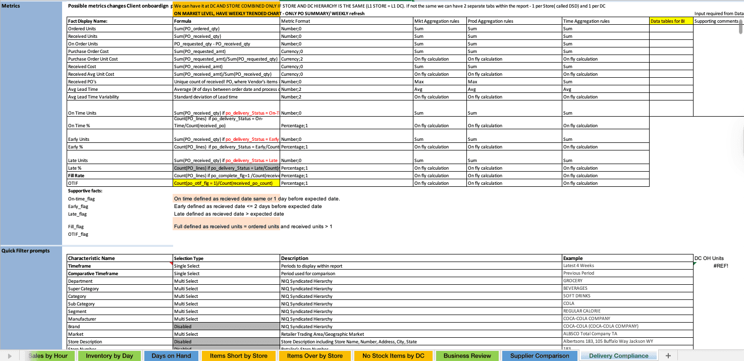
What each KPI actually meant — OTIF, fill rate, and risk flags needed shared formulas before trust.
Interface behaviorLock shared formulas and risk flags so OTIF and fill rate mean the same thing in every review.
Shared definitions
| Metric | Formula | Status |
|---|---|---|
| OTIF | On-time · in-full | Shared |
| Fill rate | Ordered vs shipped | Shared |
| Risk flag | Threshold breach | Review |
Lock formulas →
Scan → compare → investigate — filters, period, and context shaped every metric read.
Interface behaviorKeep period and hierarchy continuous so comparison does not reset the investigation.
Investigation path
Keep filters →
Layered reporting over flat dashboards — overview, trends, and compliance on one review path.
Interface behaviorPrefer a layered model so orientation and evidence share one scorecard without dumping every row first.
Scorecard layers
One review path →
[04]Business requirement
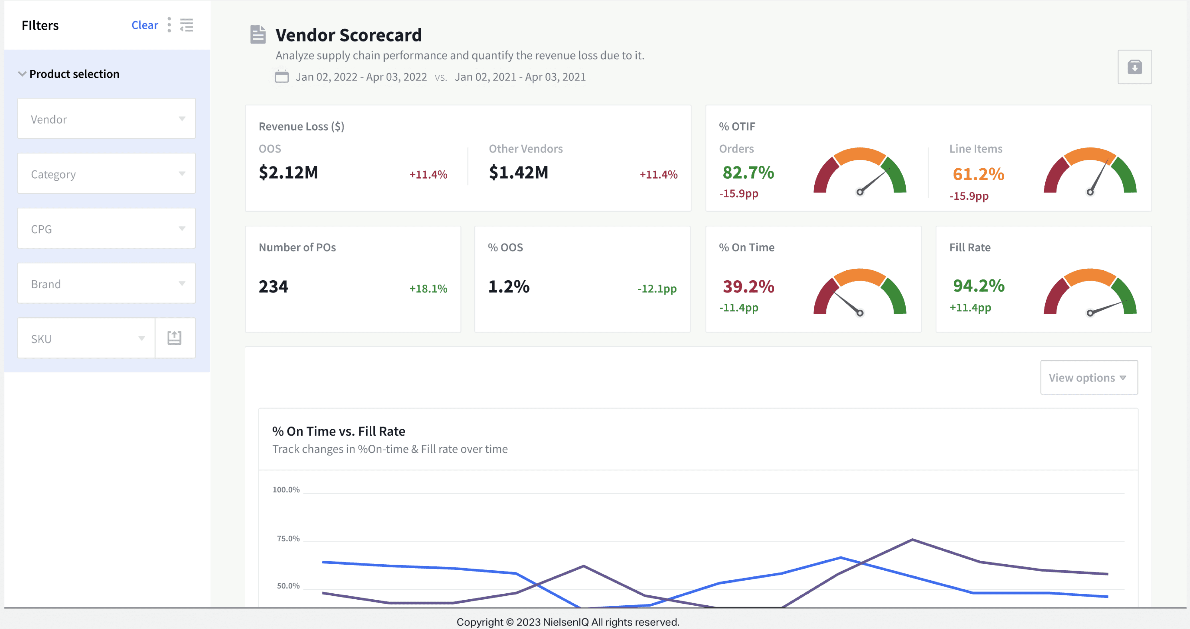
Redesign the legacy supplier scorecard into NIQ standards and prototype comparison patterns — including chart comparison and sparkline label interactions — that hold up in client review conversations.
Bring the legacy scorecard into NIQ design patterns and visual standards.
Support side-by-side chart comparison and clearer metric interpretation.
Use interaction concepts like sparkline labels to communicate future product value.
Delivery Compliance · metric definitions + filter prompts
[05]Core problem
I redesigned the Vendor Scorecard into a layered reporting workflow: KPI health → comparison → trend → validation.
Make scoring transparent enough for retail and vendor teams to debate from the same frame.
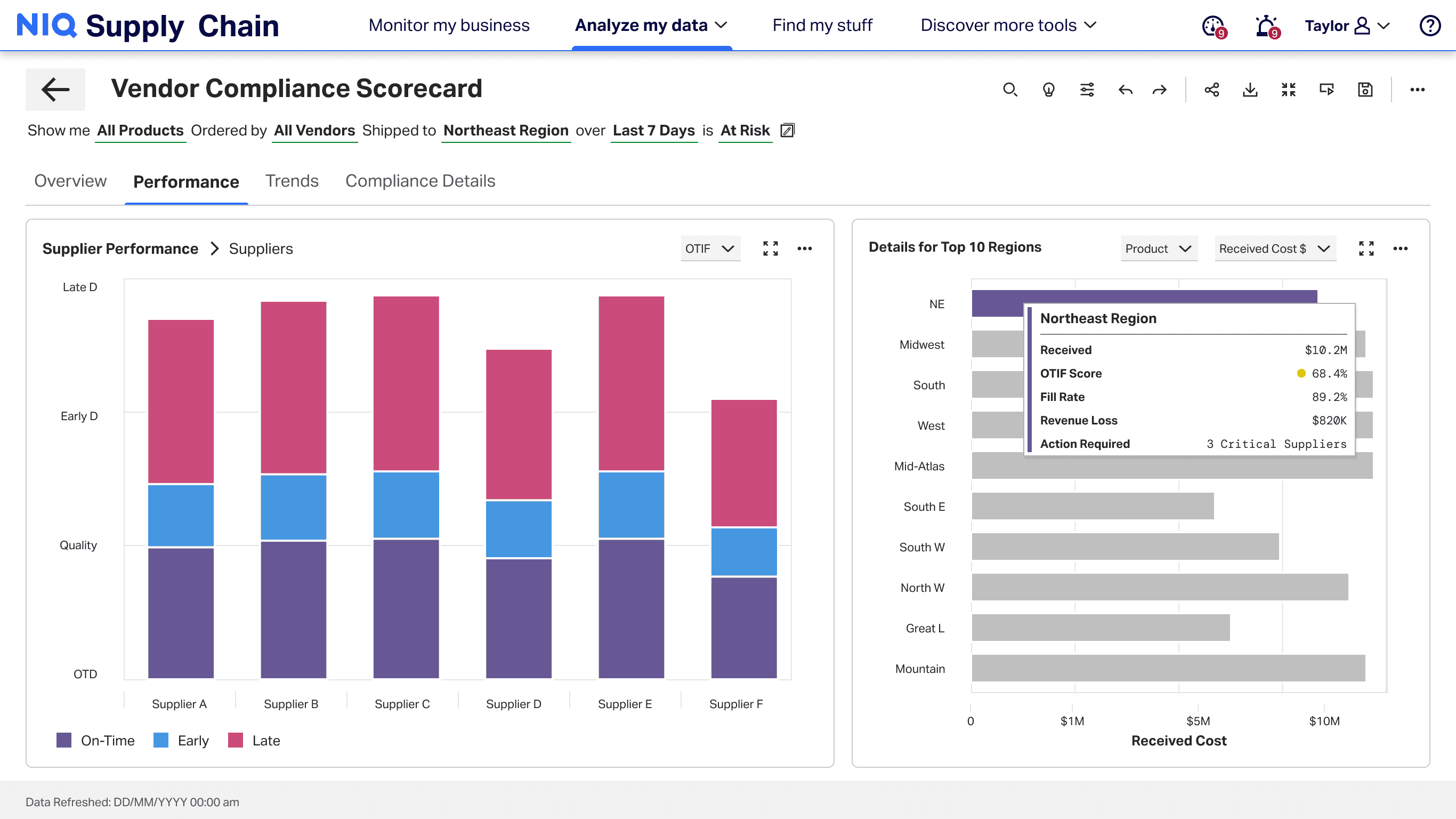
Support scan → compare → validate without leaving the reporting system.
Preserve low-fi exploration evidence that shaped the final NIQ Discover direction.
[06]Intervention
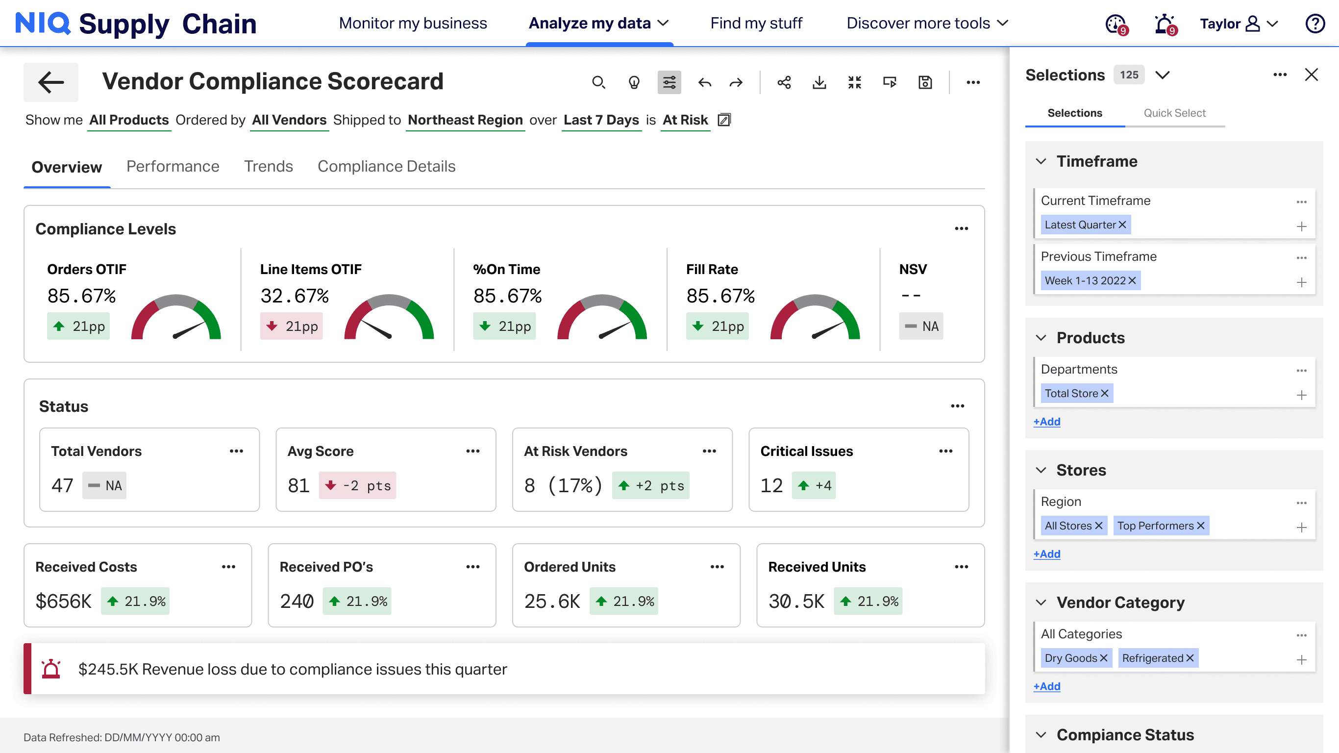
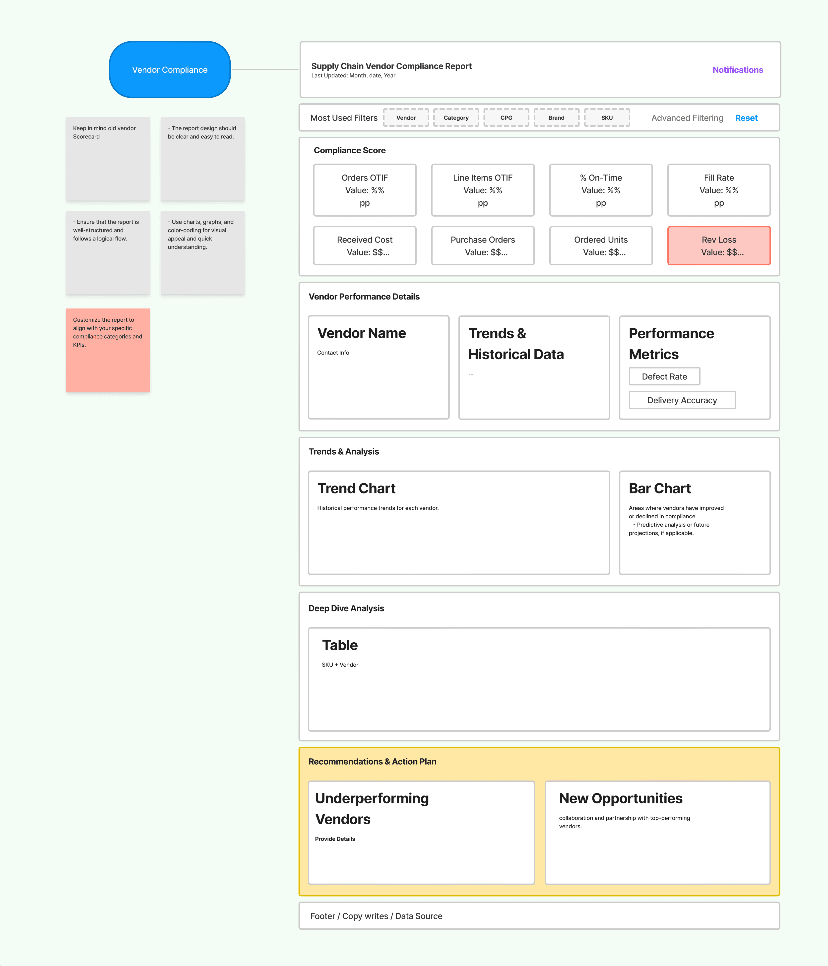
Executive summary, comparison, and validation layered into one review-ready reporting spine.
Architecture
One shared path for retail and vendor teams.
Core decisions
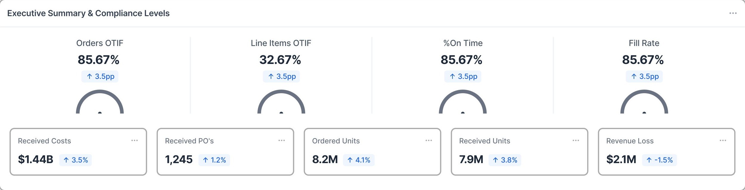
Surfaced high-level signals like OSA rate, missed sales, flags, value sales, and operational health.
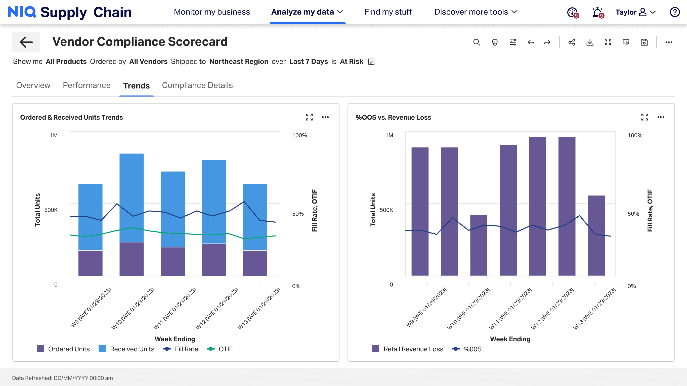
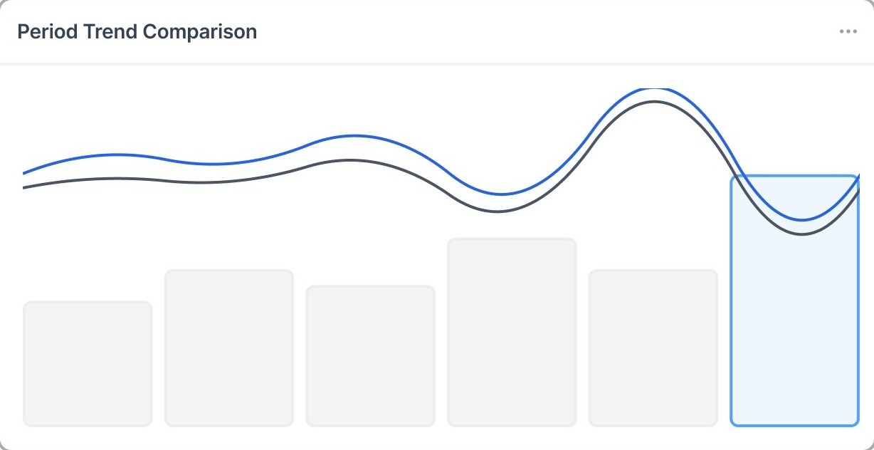
Supported current vs previous period review, standard vs promo analysis, and comparison across performance dimensions.
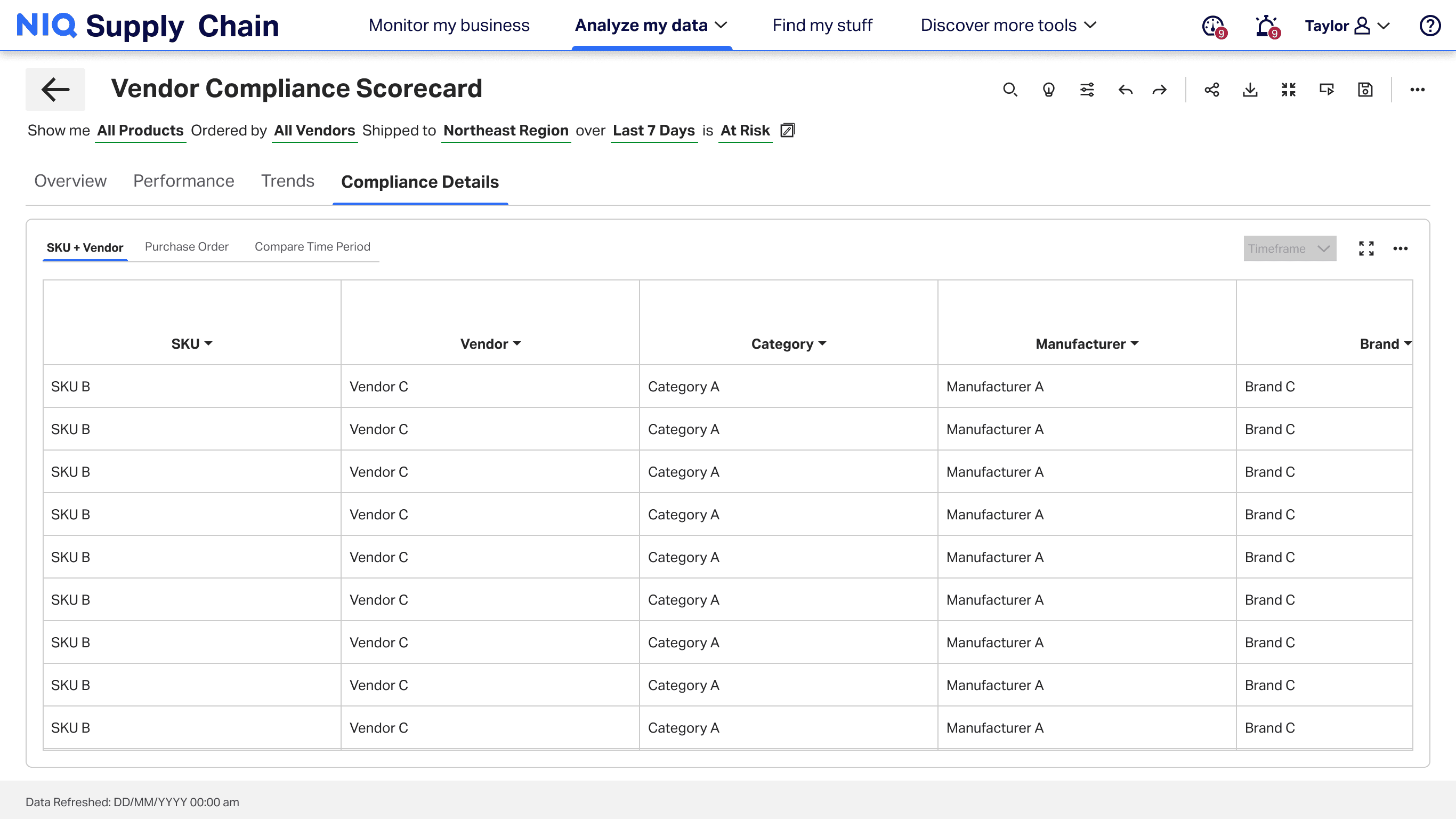
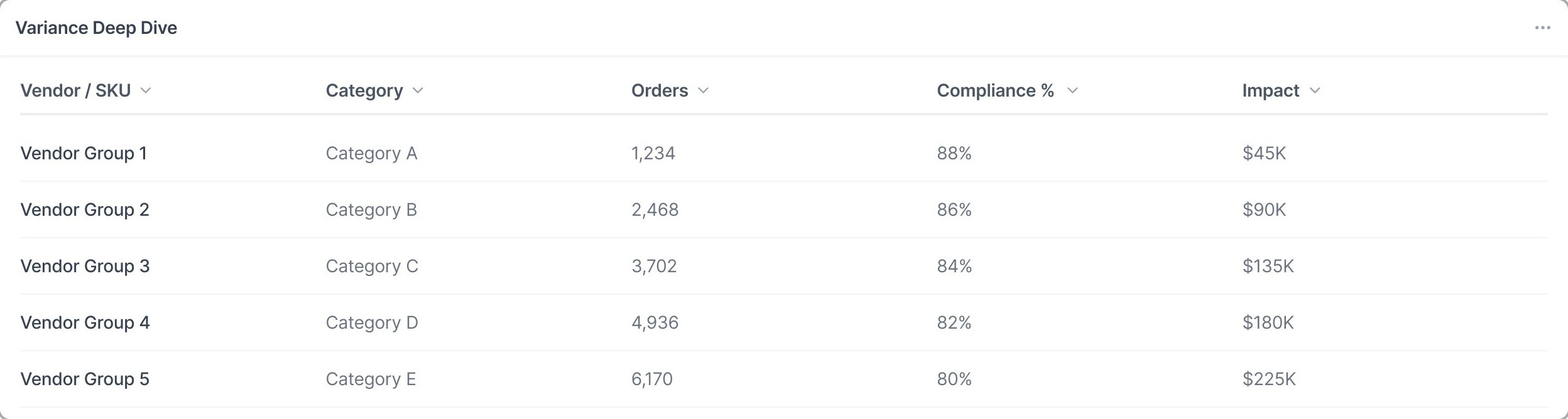
Connected summary signals to geo analysis, compliance details, root causes, and tabular evidence.
[07]Concepts
Low-fidelity directions that tested which reporting priority should lead — KPI, comparison, investigation, or a modular spine — before higher-fidelity design.
Executive KPI summary first — strong orientation, weak investigation depth.
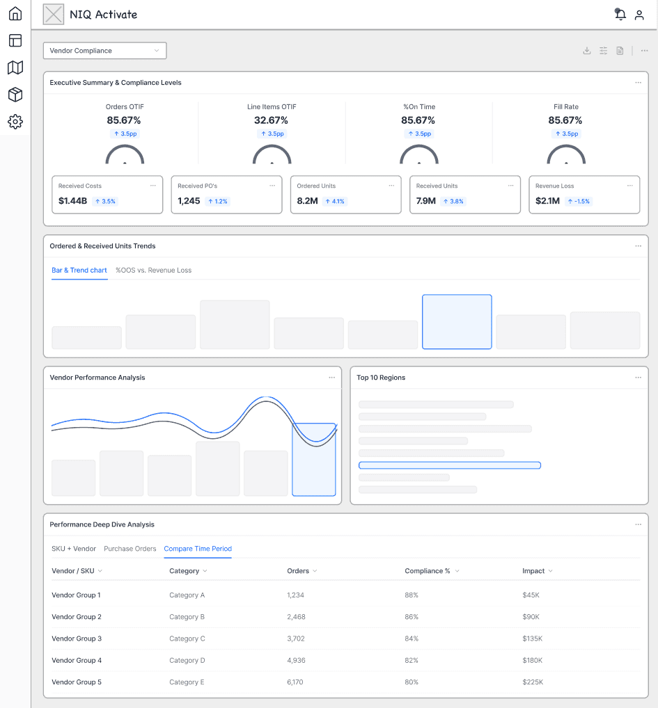
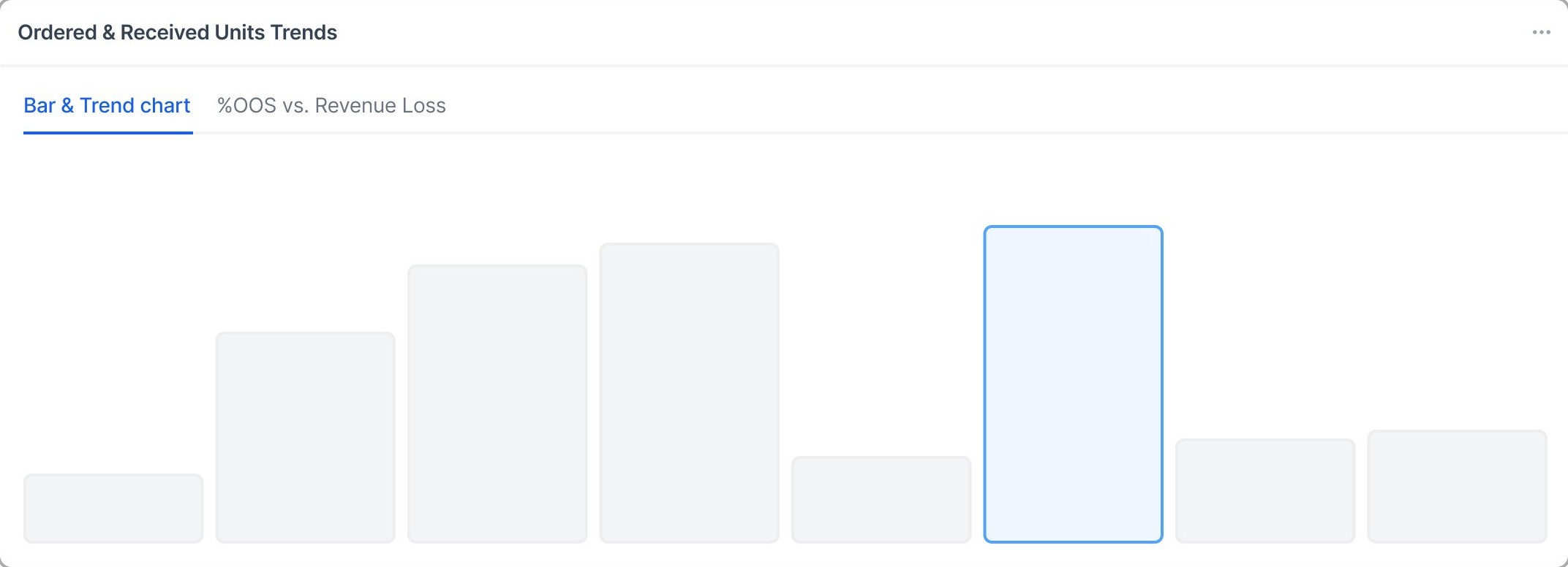
Trends and comparisons higher — better analysis, weaker scanability.
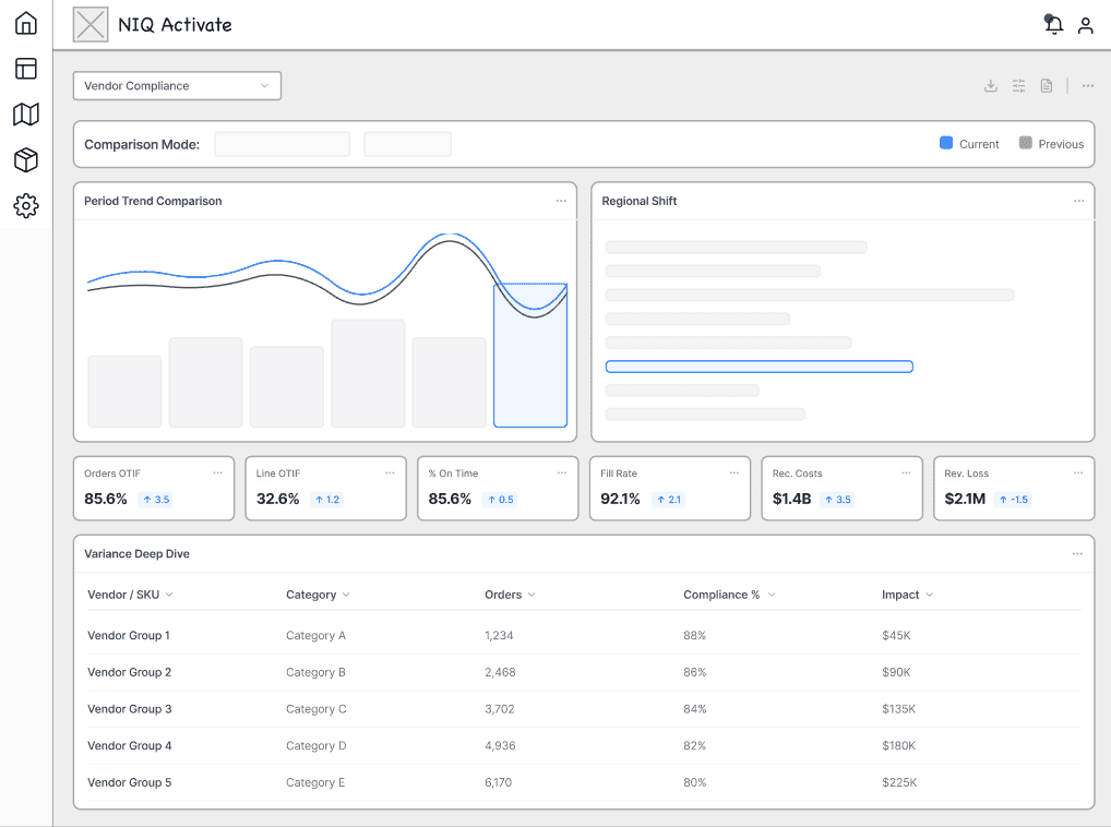
Deep-dive tables early — too deep for first-pass review.
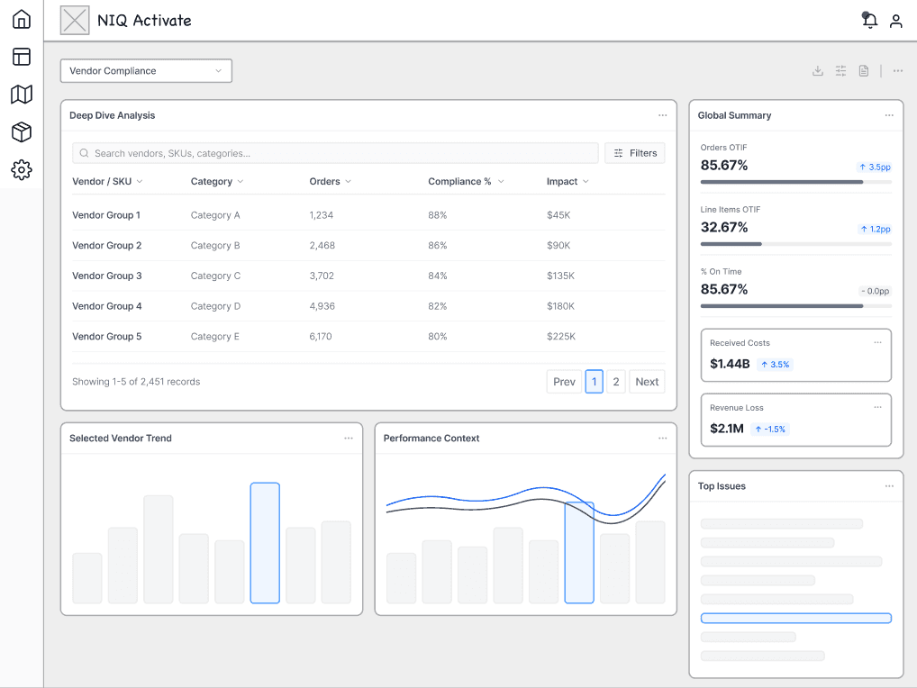
Balanced summary, trends, and records — closest to the final path.

[08]Convergence
Kept patterns from concept exploration — orientation, comparison, investigation, and modular layers.
Executive summary stayed first — orientation before analysis.
Period and peer comparison stayed in the main path.
Validation tables remained reachable without leaving the report.
Layered modules survived into the Discover experience.
[09]Workflow
Information architecture around Overview, Performance, Trends, and Compliance — scan → compare → investigate → validate.
First-time exploration of the scorecard
Designed for structure understanding and top-level scanning.
Advanced investigation and comparison
Optimized for deep analysis and multi-dimensional comparison.
Repeat monitoring of what changed
Built for quick context resumption and change validation.
[10]Framework
One connected scorecard path — Overview orientation, Performance comparison, Trends, and Compliance evidence without leaving the report. Screens advance while in view.
Overview
Executive Overview with filters — scan risk and performance before diving deeper. The workflow begins with a shared scorecard surface, not another disconnected export.
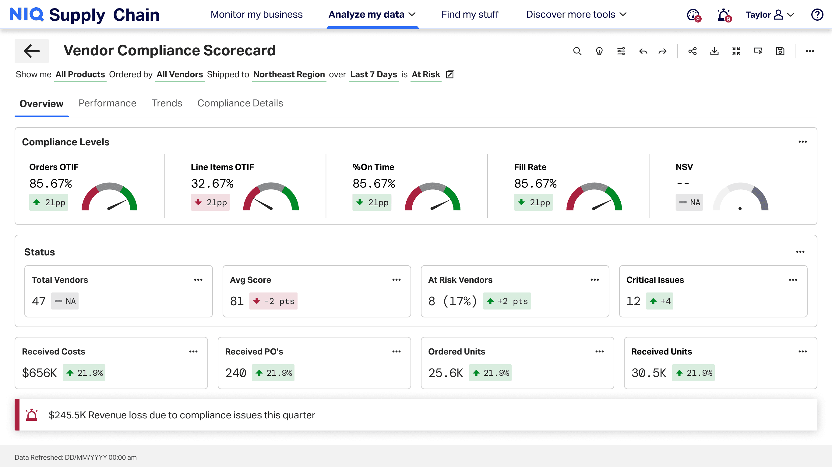
Screen 01 of 04: Orient on supplier health first
[11]Validation
Iterative review on real reporting behaviors — from KPI summary, to comparison, to evidence-backed follow-up.
The evolving structure made the scorecard easier to scan at the top level while still supporting deeper analytical follow-up.
BeforeAfter
| Record | Status | Proof |
|---|---|---|
| OTIF delta | Flagged | Linked |
| Fill rate | On track | Linked |
| Compliance | Review | Open |
| Root cause | Evidence | Row |
Scan health and risk first — shared language before debate.
Layered reporting beat both a thin dashboard and an evidence dump — orientation and audit depth had to share one path.
Detailed views remained essential for validating performance shifts, so the final structure kept evidence accessible without making the overview too dense.
[12]Impact
Four outcomes from the redesigned path — audit speed, risk surfaced earlier, OTIF lift, and quarterly cost savings.
Audit prep time reduced
Revenue risk surfaced earlier
Supplier OTIF improved
Quarterly audit cost savings
[13]Next step
Inventory, supply, or exception systems — a focused sprint for an investigation spine, explainable risk, and proof stakeholders can trust.